Girlboss 2.0 Brand Guidelines
2022
Following the 2021 Girlboss rebrand, we developed a comprehensive 50+ page brand bible to establish a unified and flexible identity system. The goal was to ensure the brand could be applied consistently across marketing, social, and creative — while still allowing space for future growth and creative interpretation.
My Role
Evaluated real-world use cases of the refreshed brand across campaigns and content
Defined, refined, and documented brand guardrails for consistent application
Developed visual frameworks for logo usage, color, typography, layout, and social media systems
Collaborated cross-functionally to align creative outputs with strategic brand goals
Approach
The challenge was to distill a highly expressive and layered brand identity into clear, adaptable guidelines — ensuring both consistency and creative flexibility. I worked to translate abstract brand principles into actionable design systems that could be easily applied by internal teams and external partners.
Impact
The resulting brand bible became the foundation for all Girlboss creative output, helping streamline collaboration, maintain visual integrity, and support a cohesive brand experience across platforms.
Sample Pages
-
![]()
Our Work
-
![]()
Our Logo
-
![]()
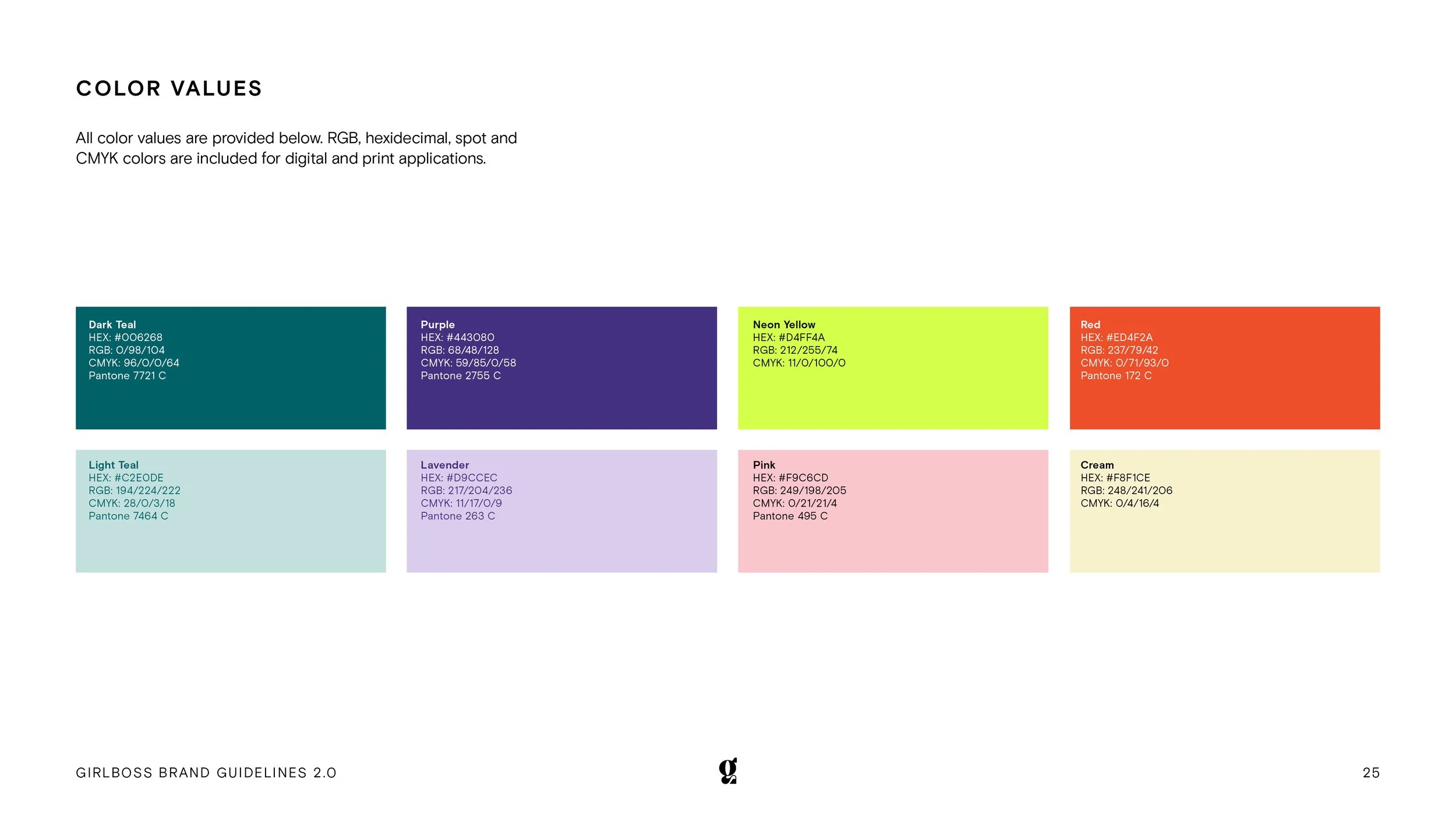
Color Values
-
![]()
Color Usage & Accessibility
-
![]()
Graphical Treatments
-
![]()
Primary Typefaces
-
![]()
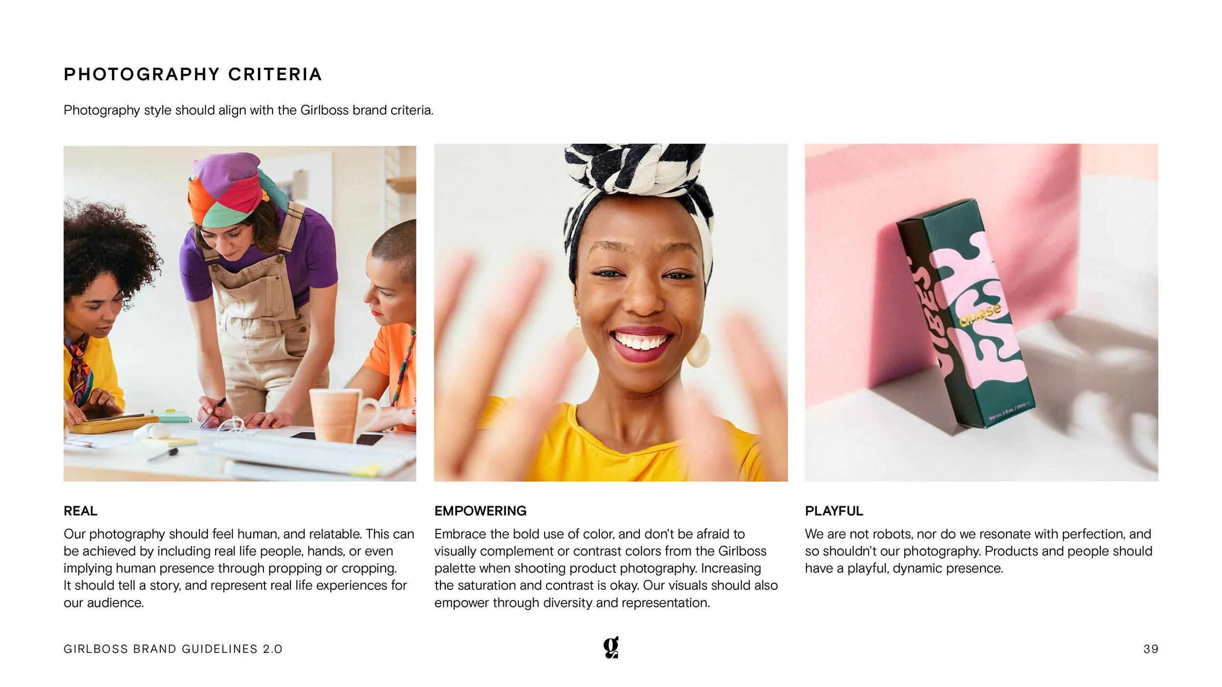
Photography Criteria
-
![]()
Still Life Photography
-
![]()
Stock Photography & Video
-
![]()
Website
-
![]()
Homepage Hero Banners